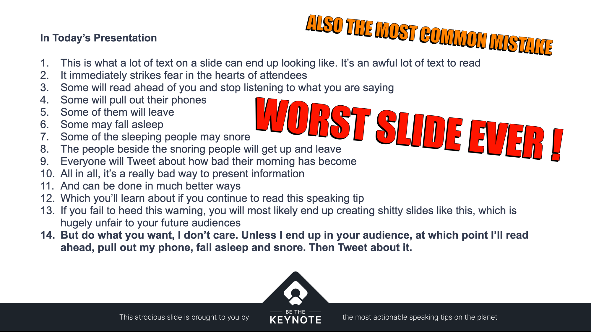
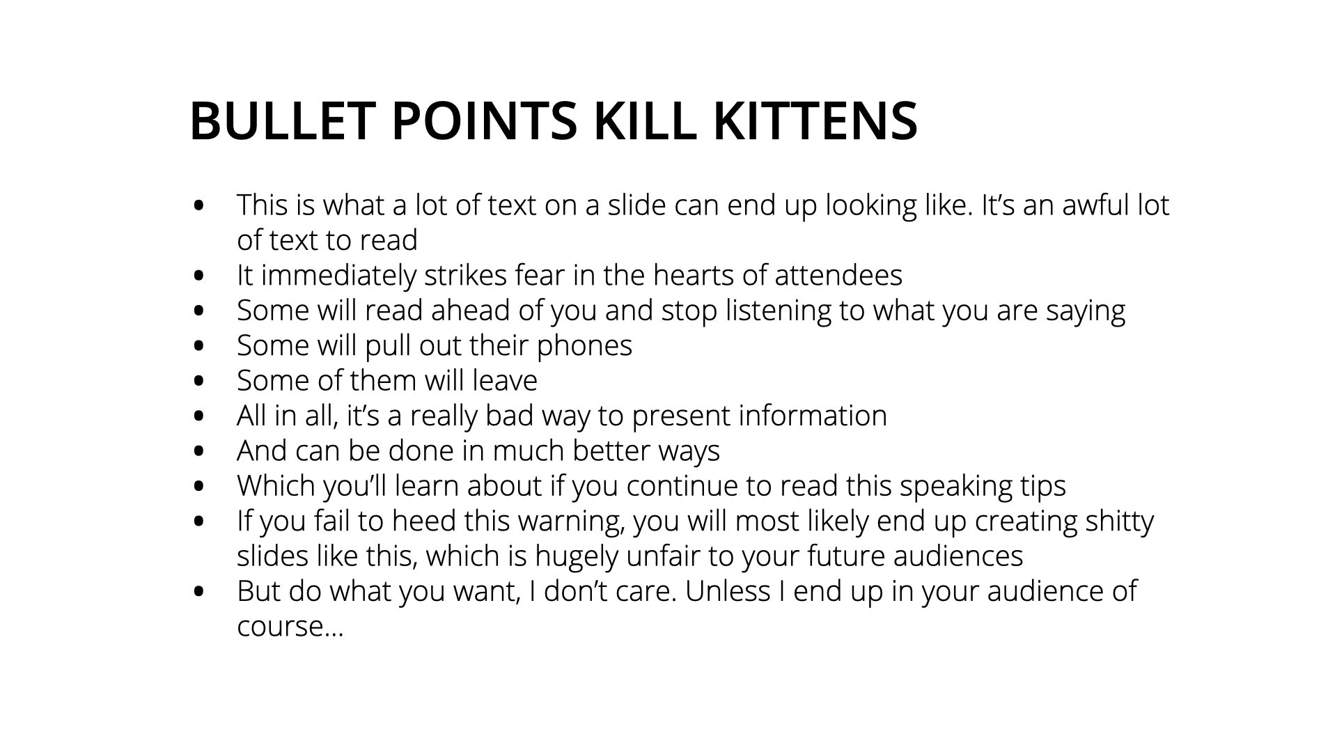
The worst design faux pas a presenter can make is a slide loaded with so many bullet points it creates “The Wall of Text”.
You know it when you see it, and it’s universally hated by attendees and people watching virtual presentations, yet somehow I still see 80% of speakers making the mistake time and time again.
If you’ve ever made a slide like the one below, you better start using the progressive reveal technique or we’ll find you and delete the offending slides from all of your presentations. Then we’ll delete your presentations too. Just kidding. Not really.
How to Avoid Making Bad Bullet Points
The solution to bad bullet points is a slide design technique called the Progressive Reveal, which is exactly as it sounds – you reveal the information piece-by-piece while making each previous point fade into the background (but still be visible).
It sounds simple, and it is. Read on to see how it’s done.
It seems so startlingly obvious but 90% of presentations do a terrible ****ing job of using bullet points. If you use a progressive reveal your bullet points will be a shimmering glass of awesomesauce.Click to Tweet
What Are Bullet Points Used for in Presentations?
Some of the common use cases for bullet points are shown below. If you have any slides like this you need to A) stop doing it B) fix them as soon as you finish reading this post.
Table of contents/overview slides

The generic dumping ground bullet point list
Columned lists of data and information (col1: description, col2: value)

Why do People Use Bullet Points in Presentations?
Common reasons for this horrific use of presentation software features are:
- The presenter is problem unaware: which means they don’t know that it’s a bad thing to do.
- The presenter is solution unaware: meaning that they know it’s a bad thing to do, but they don’t know there’s a better way.
- The presenter is lazy: they get it, but don’t care enough to do any better. Shame. Shame. Shame.
The Solution is the Progressive Reveal
The idea is to expose the information on your slide one piece at a time so that the audience (and you) are only focusing on the most salient point in a given moment.
As you click through the list, an “active” bullet point is added (visually bolded for contrast) and the preceding line fades to approximately 25% transparency, which allows it to remain in view for context and completeness but it doesn’t interfere with your ability to focus.
You can see how easily your eyes are drawn to each bolded point, and the rest of the content is still there for reference if required. It fulfills all requirements by removing reading ahead, emphasizing the current point, and retaining the context of previous points.
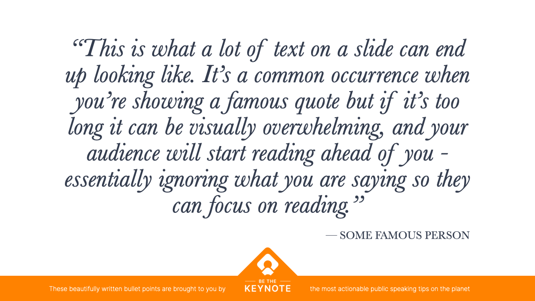
Bonus Tip: Making Long Quotes More Readable With The Progressive Reveal
For a quote or paragraph of content, it can either just heighlight one key portion of the text, or if you want to go through it all, you can modify the technique to include all of the text and just move the highlighted portion as you click through the slides – which would allow reading ahead, but the emphasis prevents it somewhat. The slides below demonstrate how you can walk through a quote or similar block of text.